Fellpack & The Round
Website design and development for two restaurants in the Lake District
Website design and development for two restaurants in the Lake District
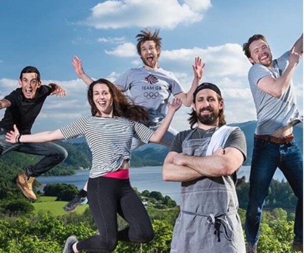
Fellpack and The Round are two restaurants in Keswick that are owned by the same partners, each with a very different feel. Fellpack was established a few years ago and has evolved during that time to now have a relaxed bistro feel, whereas The Round started up as a great place for burgers and drinks, also recently expanding to provide brunch.
The team behind the restaurants wanted to make a slight shift to bring the restaurants together so they are more closely aligned meaning they can maximise their online presence rather than competing against themselves.
As we were getting started, the team decided to go for a name change for the Fellpack restaurant, rebranding it 19 Lake Road. Despite doing this, they wanted to retain the Fellpack name for their wider ethos and to cover future ventures they have planned.
We recommended designing and developing a single new website that would host both restaurants while still celebrating the differences between each and also still showcasing what Fellpack is and does. We used our bespoke WordPress theme called Lark, which is a robust and secure solution and something that is fast, environmentally friendly and has lots of functionality included. This sped up the development process and also meant it was more cost-efficient as it comes with so much built into its core.

For each of the restaurant pages, we created a number of flexible content blocks to allow for a clear structure. The added benefit of this is that as more restaurants may be established in the future, they can have the same structure. At the same time, if they create new aspects to their business that aren’t restaurants, they can use similar blocks but in a different order or without certain items such as menus. For example, a block with icons can be used for many different purposes.
We went for a palette of colours to be used on the website that would help a user understand which restaurant they were seeing content for. For example, when on the homepage a user would see petrol blue, when on 19 Lake Road it is a coral scheme, and for The Round it is teal and orange. This colour scheme would be maintained on each page but also other areas of the site such as the blog. So a blog post all about The Round would be obviously different to posts about 19 Lake Road.
We also worked on user experience to help visitors see which restaurant they were viewing and to avoid confusion with bookings. We updated the logo in the centre of the main menu as users moved between the restaurant pages. This would reduce the administration time in handling bookings, meaning the management team could be more efficient.


With plans for expansion in the future and the lockdown affecting current income, we recommended implementing a new shop on the website. Fellpack already sold a few items in the restaurants, but by putting them online they would have a new platform and greater audience for the products. Furthermore, this would enable them to create new items in the near future as their business develops. From clothing to ready-made food that can be collected from a site, it opens up a number of opportunities.
We launched the website once the lockdown rules had eased and just before the Eat Out to Help Out scheme started. Having had a few months off with the restaurants closed, the team weren’t sure how things would change. The result was overwhelming so we needed to quickly implement an online booking solution to enable people to quickly make the reservation they wanted.
Within a day of going live, the difference was incredible. The website was able to take this admin away from a member of staff, maximising the efforts of the team to actually serve customers.

Going live with a new website during a pandemic is hard. In this case, there were so many unknowns around how people would feel visiting restaurants but the comeback was incredible. It was crucial that the website was a success in order to make up for the lost revenue and clearly it has been popular with most tables booking out a few days in advance.
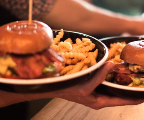
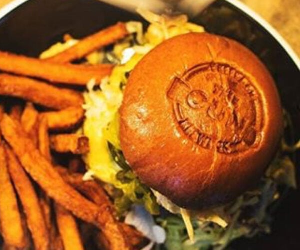
We loved working with the team to produce a creative website with incredible imagery (we apologise if you are reading this and looking at the pictures of food if it is just before a mealtime). It was also a lot of fun for us thinking of all of the ways the website needs to work now and in the future. We believe websites should be made to really last and so enjoyed the challenge of considering how it would be scaled in the future. This means that when the Fellpack team is ready to expand again, they should be able to do so without any involvement from us, meaning they can put all of their investment into whatever exciting changes they want to do.