If your brand's colour palette, typography, or visual style doesn't meet accessibility standards, no amount of careful design or development downstream will fix that. We've sat in pitches where we've had to break it to clients that their beautiful new brand guidelines needed to change before we could build what they'd asked for.
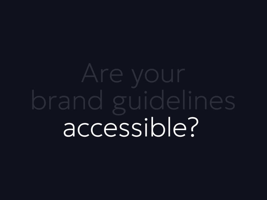
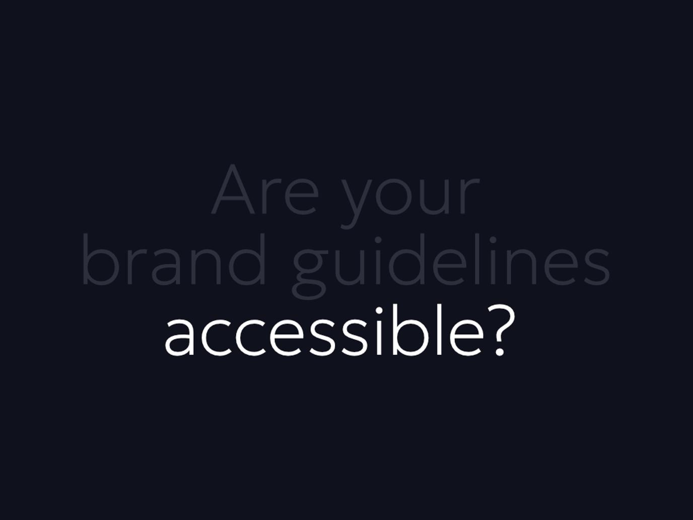
A lot of conversations about web accessibility focus on websites: contrast ratios on buttons, alt text on images, keyboard navigation, screen reader compatibility. Those things matter. But there’s a failure point that tends to get overlooked, and it happens before a single page has been designed.
It happens at the brand level.
Beautiful, but not accessible
Earlier this year we were recently in a pitch with a large organisation that had invested significantly in a new brand identity. The work was genuinely impressive – considered typography, a distinctive colour palette, a clear visual language that felt modern and deliberate but still an evolution to represent their history. They were proud of it. Rightly so.
Their brief to us was for a fully accessible website, built to WCAG 2.2 AA standard. The problem was that their brand guidelines and that brief were in direct conflict with each other. We had to be honest with them: parts of the brand would need to adapt before we could build anything that met that standard.
It wasn’t an easy point to make when you’re pitching for a new project. But it was an important one – and one we’d rather have at the start than six months into a project.
Why branding is often the first point of failure
WCAG 2.2 AA sets specific requirements for colour contrast. Text needs a ratio of at least 4.5:1 against its background for normal-sized copy, and 3:1 for large text. UI elements – borders, icons, interactive states – need at least 3:1. These aren’t arbitrary numbers; they reflect what research tells us people with low vision, colour blindness, or age-related sight changes need to read and navigate comfortably.
Many brand colour palettes don’t meet these thresholds. Not because the designers made a mistake, but because brand design and accessible design are guided by different constraints. Brand design is often optimised for print, for large-format advertising, for environmental applications where contrast behaves differently. A pale sage green on off-white can look effortlessly sophisticated on a poster. On a website, it fails the contrast test.
Typography is another common sticking point. Thin, elegant typefaces, the ones that read beautifully in a brand campaign, can be extremely difficult to read at body copy sizes on screen, particularly for users with dyslexia or low vision. Very light font weights (100–300) often cause problems at smaller sizes. All caps is hard again for dyslexic people. Decorative or display faces used as primary typefaces can be outright inaccessible. The brand team may have licensed a font specifically for its personality. That personality may not translate to usability.
Colour-only conventions are a third area. Brand guidelines often rely on colour to communicate meaning – status, categories, hierarchy, urgency. If those distinctions exist only in colour, users who can’t distinguish certain hues have no way to interpret them. WCAG requires that colour is never the sole means of conveying information.
The knock-on effect
When a brand is inaccessible, everything that follows it will be too. The web designer can’t make accessible choices if the approved colour palette doesn’t support them. The developer can’t fix what hasn’t been corrected at source. The finished site will either fail WCAG or it will deviate so significantly from the guidelines that the brand team won’t recognise it.
Either outcome is a problem. The first is a legal and reputational risk. The second undermines the investment in brand identity that the organisation has already made.
This is why we say accessibility needs to be part of the very first conversations. Not at the design stage. Not at the build stage. At the brand stage – or, ideally, even earlier, when brand choices are still being made.
Accessible branding doesn’t mean boring branding
The instinct, when accessibility constraints are introduced, is often to assume the result will be flat or generic. That assumption is wrong.
High contrast doesn’t mean black on white. It means understanding which colour combinations in your palette work, and which need adjustment. Often this is a matter of tweaking tones rather than replacing colours wholesale – a brand’s identity can remain intact while its practical application becomes more considered.
Typography constraints don’t rule out distinctive type. They push you towards typefaces that perform as well at 16px as they do at 160px. Some of the most recognisable type choices in digital design are also highly legible.
What accessibility does rule out is decoration at the expense of function. If a font, colour, or visual pattern creates barriers for a significant portion of your audience, then its presence in a brand system is doing harm regardless of how refined it looks.
What good looks like
Organisations that get this right tend to share one thing: they involve accessibility thinking in the brand development process, not just the website development process. That might mean accessibility criteria built into the brief for a brand agency. It might mean a review of proposed palettes and typefaces against WCAG before guidelines are finalised. It might mean guidelines that explicitly document accessible colour combinations and usage rules, so that anyone working within the brand system doesn’t have to guess.
It also means being willing to revisit decisions when they’re found to be problematic. The conversation we had in that pitch wasn’t comfortable, but the organisation took it seriously.
That’s the only reliable way to build something that meets a WCAG 2.2 AA brief: start with brand foundations that make it possible or adapt if you’ve already got started.
If you’re about to commission a new website and accessibility is part of the brief, it’s worth asking whether your brand is ready for it. Get in touch and we can tell you quickly whether there are issues to address before design begins.