Client name withheld at their request.
This client is a specialist professional services provider operating in highly regulated sectors, with a long-established reputation for accuracy, compliance, and expertise. They came to us at a point of deliberate reinvention – ready to move their business forward, but without the brand or website to show it.
Project overview.
Client: Confidential
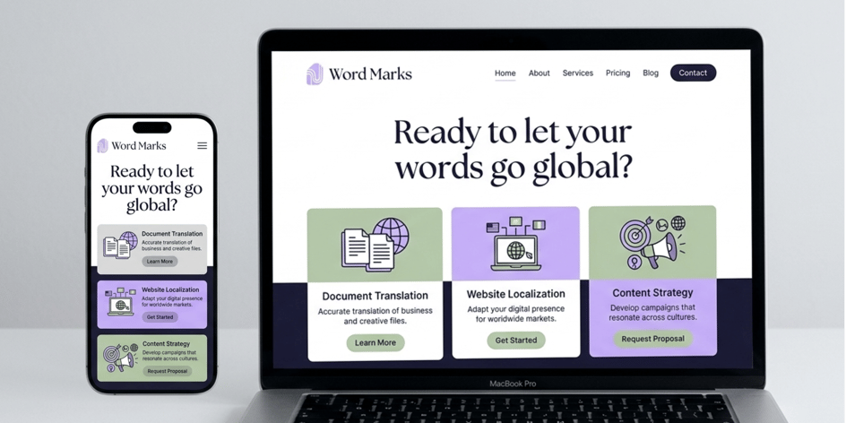
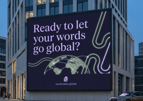
Our client asked us not to share their name, so we created Word Marks, a fictional brand, to show the work. The logo, visuals and examples in this case study recreate the approach, process and style of the real project. The results and figures are real.
The business has a strong track record, deep sector expertise, and a growing offer that blended long-standing capability with modern, technology-led solutions. However, none of that came through when you visited their website.
The site was severely outdated. It didn’t reflect the quality of the work they were doing, the range of services they offered, or the direction the business was heading. The gap between the reality of the business and its digital presence was a real problem – and for a company whose clients operate in sectors where trust and precision are non-negotiable, that gap had commercial consequences.
But the challenge was bigger than a visual refresh. Any new identity had to do more than look modern. It had to communicate trust, professionalism, and reliability from the very first moment a prospective client landed on the page. At the same time, it needed to reflect an increasingly technology-led offer without losing sight of the heritage and expertise that made the business credible in the first place.
The brief covered both brand and website. They needed a new identity that could carry the business forward, and a site that could present their services clearly to very different audiences – across multiple languages.
Scope of work.
- Brand strategy and development
- User experience
- Website design
- Accessibility
- Web development
- Multilingual development
- CMS training
- Content migration
- Ongoing SEO and AI search
Branding.
Before touching the website, we ran a brand identity exercise. The aim was to understand how the business wanted to be seen, how it wanted clients to feel, who its different audiences were, and what visual territory felt right. Doing this properly first meant that everything that followed, the website design, the illustration style, the photography, had something solid to be designed against, rather than the brand being reverse-engineered from a set of web pages.
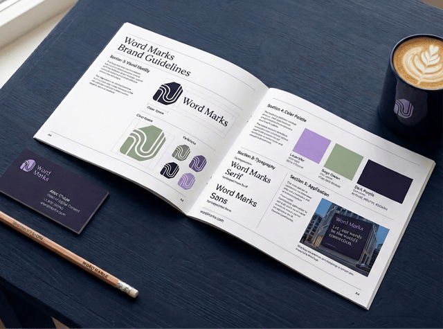
The brand direction was built around five core values: innovation, trust, professionalism, client focus, and reliability. Multiple logo concepts were developed and presented. The chosen route struck a balance between the business’s established heritage and its forward-looking direction – clean and modern, while carrying enough weight to feel credible in regulated sectors.
The colour palette balanced energy with credibility. A bold primary colour introduced forward movement and character, while a deeper secondary tone grounded the identity in stability and trust. Typography was chosen to feel legible, confident, and distinctive – professional, but not cold.
Tagline development took time. It needed to stay simple and memorable while still capturing the breadth of what the business does and where it’s heading.
The final brand output included a full set of guidelines: logo usage, typography, colour application across print and digital, accessible contrast combinations, graphic devices, illustrations, and tagline usage.
Design.
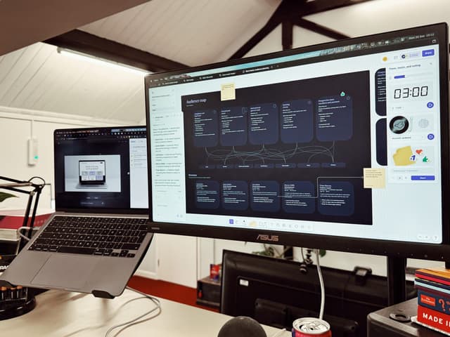
The website design process began with audience planning. Before any layouts were sketched, we mapped out who was coming to the site, what they needed to find, and what a successful visit looked like for each of them. That work defined the navigation, the page structures, and the hierarchy of content throughout the site.
The site was designed using a block-based system adapted to the client’s brand – a library of reusable content blocks, plus full page designs showing how those blocks come together in practice. The point of this approach is independence. The team can build and update pages themselves without needing us every time something changes.
A significant part of the design work involved building out a custom illustration library. A large set of bespoke illustrations was created to represent the company’s services, specialisms, accessibility features, and customer groups. These needed to communicate complex ideas quickly and clearly, often at very small sizes. Getting them right was detail-heavy work, but they became one of the most distinctive parts of the finished site.
Photography was handled with similar care. To stay within budget, stock imagery was used – but selected and adjusted to feel warm, unified, and consistent with the wider brand rather than generic or corporate. AI-assisted editing helped bring imagery into alignment with the palette and reflect the client’s values around sustainability.
Accessibility.
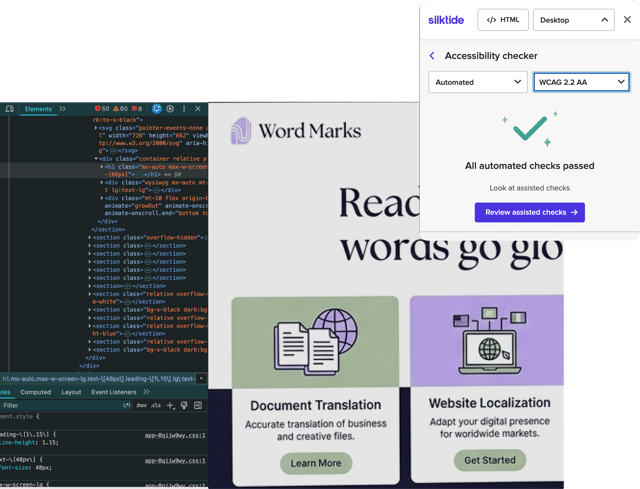
Accessibility was a central requirement, not an afterthought, and it shaped decisions across every phase of the project. The target, which was a crucial requirement, was WCAG 2.2 AA compliance.
At brand level, the colour guidance included accessible contrast combinations for both print and digital use, built in from the start rather than checked at the end. In the design phase, accessibility informed layout decisions, colour application, and mobile responsiveness. During development, accessible coding practices were required throughout. At handover, we provided the client’s team with a guide on writing accessible content, alongside CMS training to help them maintain that standard as they continue to add to the site.
Accessibility testing was carried out during development and again at the end to verify compliance against the AA target.
Development.
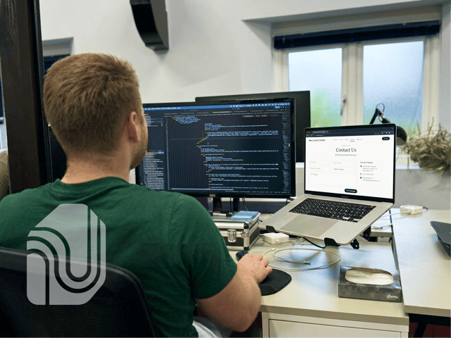
The site was built on Lark, our WordPress framework. It gives a strong technical foundation from day one – fast, secure, sustainable, and accessibility-first – rather than those things being added later as a layer on top of something that wasn’t built with them in mind.
On top of that foundation, we built a flexible block system, a blog, a case study section, detailed service and expertise pages, and a contact form integrated with the client’s CRM. Analytics were set up in a way that’s fully GDPR-compliant without requiring a cookie banner. We also built a dynamic LLM text file so AI search tools index the right content – something that’s increasingly important for businesses whose prospective clients use AI tools to research suppliers.
Content migration was handled carefully. Old URLs were mapped to new ones and redirects were set up so the site’s existing SEO value carried across. Go-live was managed to minimise downtime.

The multilingual challenge.
The biggest single challenge in the build was making the site work properly across multiple languages, with localisation designed in from the start rather than retrofitted afterwards.
That meant working closely with the client’s team to get every page translated, checked, and loaded correctly. It also meant designing for the practical realities of translated content – some languages expand significantly in length compared to English, and layouts that work fine in one language can fall apart in another. We designed and tested for that throughout.
It’s technically detailed implementation work, and there were hurdles along the way – but the result is a site that reads properly in every language it’s published in, and that the client’s team can manage themselves through a single CMS.
We kept communication structured throughout. Regular written updates were followed by calls to confirm priorities, address dependencies, and make sure both sides were aligned. Feedback was managed through a shared document so nothing got lost. The client’s team were trained on the CMS at handover so they could take it on with confidence.
The results.
The project delivered a complete transformation. An outdated website and an identity that no longer reflected the business have been replaced with a coherent, accessible, and genuinely effective brand and digital presence.
The numbers speak clearly. Following launch, the business saw a significant increase in website traffic and a substantial rise in website leads. The site now meets WCAG 2.2 AA accessibility standards, is published across multiple languages, and is run day-to-day by the client’s own team.
Beyond the metrics, the new brand does what the old one couldn’t. It communicates trust and professionalism from the first second, positions the business credibly in the sectors it serves, and reflects the modern, technology-led direction it’s heading in – without losing the heritage and expertise that made it credible in the first place.
We’re continuing to work with the client on ongoing SEO and AI search, building on the foundation the new site and brand have given them.