User experience and conversion rate optimisation.
A well-designed website is essential for achieving your business goals. If content is hard to find, pages load slowly, or interactive elements don’t function as expected, users may become frustrated and leave. At We Create Digital, we assess website usability, identify pain points, and provide clear, actionable recommendations to enhance user experience (UX) and improve conversion rates.


Understanding user behaviour.
To design a website that feels effortless to use, we start by understanding how people experience it in the real world. We use a range of UX tools to observe behaviour, spot friction, and identify the improvements that will make the biggest difference.

Heatmaps
By tracking where users click, scroll, and spend time, heatmaps help identify which elements attract attention and which may be overlooked.

User journey analysis
We review how visitors navigate through your website, highlighting areas where they may encounter obstacles or drop off before completing key actions.

Testing
We focus on testing hypotheses to gain valuable insights and identify new opportunities for improvement


A/B testing for better decision-making.
When updates are needed, businesses often face choices between different design or functionality options. A/B testing allows us to compare two variations of a page by showing them to different users over a set period. This method provides data-driven insights on which version performs better, helping to inform future decisions.
A/B testing is particularly valuable for:
- Improving conversion rates on landing pages
- Refining calls to action and key messaging
- Optimising checkout flows in e-commerce sites
(Note: A/B testing requires a sufficient level of website traffic to produce meaningful results.)
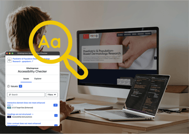

Accessibility compliance.
Accessibility is a core part of user experience. If a design excludes users with different needs, the experience breaks down. We combine automated checks with manual reviews to uncover accessibility barriers, assess how they impact real users, and identify the fixes that will make the interface easier for everyone to use.
We work to WCAG 2.2 Level AA as standard, focusing on design and practical, code-based improvements rather than expensive and ineffective third-party tools or overlays. Even when accessibility isn’t a formal requirement, prioritising it strengthens the overall experience, widens your audience, and improves engagement.

Real life user testing.
Testing websites with real users is essential for understanding how people interact with a site in a real-world context. While developers and designers may assume a site is intuitive, actual users often highlight unexpected pain points, such as confusing navigation, annoying hover menus, unclear calls to action, or slow-loading pages.
Observing users as they complete tasks provides valuable insights into their behaviours, frustrations, and expectations. This helps teams refine the design, improve accessibility, and ensure a smooth, engaging experience. Regular testing with a group of users from your target audience is key to creating a website that is not only functional but also enjoyable to use.
Conversion rate optimisation.
Conversion rate optimisation (CRO) matters because small improvements compound. A clearer journey, fewer distractions, or a better-placed call to action can increase revenue without increasing traffic. CRO helps you get more value from the audience you already have, reducing acquisition costs and improving long-term sustainability.
It starts with understanding what users are actually doing. UX insights reveal where people hesitate, drop off, or get confused, giving you a clear roadmap to improve conversions, retention, and overall satisfaction. Whether you run an e-commerce site, a SaaS platform, or a service-based business, a user-centred approach helps you stay competitive and grow sustainably.
At We Create Digital, we turn this insight into action. We analyse real journeys, test assumptions, and refine design and functionality based on evidence. From uncovering friction to rolling out targeted improvements, we help teams make informed, measurable changes that lift performance and drive results.
Improve your user experience and lift your conversions
Work with us to understand how people use your site and where they get stuck. We’ll help you remove friction, improve accessibility, and create a smoother path from first visit to conversion.
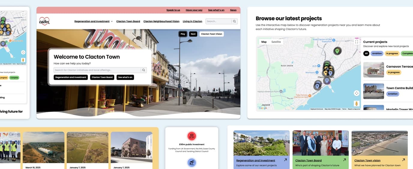
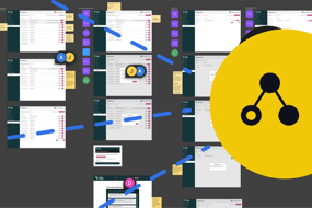
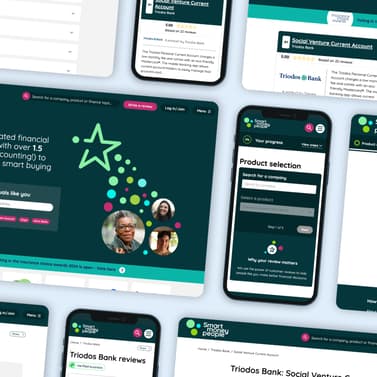
Take a look at some of our case studies.
Portfolio
Discover more about the user experience work we have carried out in past projects and how we deliver websites that meet the needs of their users.


More than a decade of trusted relationships
UX and CRO FAQs.
Here are some answers to questions we are often asked before working on UX and CRO projects.
A website usually fails to convert because users are hitting friction somewhere in the journey. This can come from unclear messaging, slow load times, confusing navigation, too many steps in a form, weak calls to action, or a checkout that feels risky or difficult. Sometimes the issue isn’t usability at all: it can be the wrong audience, the wrong offer, or content that doesn’t match what visitors expect.
The only reliable way to understand the cause is to look at real user behaviour. Heatmaps, session recordings, analytics, and structured UX reviews reveal where people hesitate, what they ignore, and where they drop out. Once you know the specific barriers, you can remove friction, strengthen trust, and guide users towards the action you want them to take.
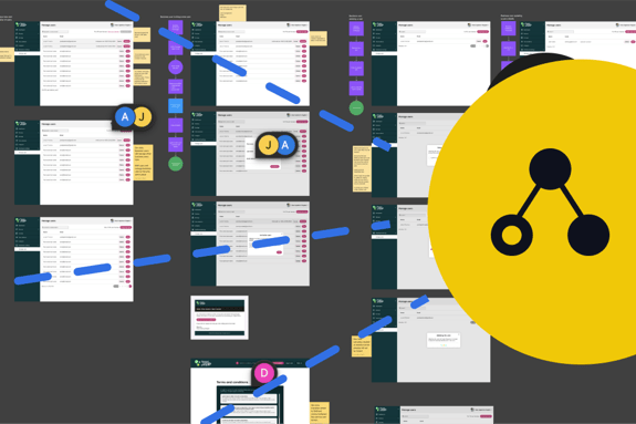
We put users at the centre of every project, starting with discovery workshops to understand your audience, goals, and challenges. From there we map user journeys, create wireframes and prototypes, and test them with real users or stakeholders to validate ideas early. Accessibility is built in from the start, ensuring designs work for everyone.
The exact activities depend on the project, but common steps include analytics and heatmap reviews, journey mapping, moderated user testing, and hypothesis-driven experiments. We keep the focus on outcomes, making websites and applications more usable and effective , not deliverables for their own sake.
A/B testing works best when there’s enough traffic to reach statistical confidence quickly – usually thousands of visitors per variation, depending on the test. The goal is to get reliable results without tests dragging on for months. If your traffic volume is lower, we’ll recommend alternatives such as usability testing, session recordings, or focused iterative changes measured over time. This way, you still gain meaningful insights and improvements without waiting for inconclusive A/B test results.
At the end of a UX review, you’ll receive a prioritised set of recommendations with clear next steps, supported by evidence from research and testing. We highlight what to change immediately, what to test next, and how to measure impact so you’re not left with a vague report but a practical roadmap. Depending on the scope, this may also include journey maps, wireframes, or prototypes to illustrate improvements and make it easier for your team to take action.
Accessibility is built into our UX process from the start. We consider it alongside usability, so barriers are identified and addressed early rather than patched later. Our reviews and designs follow WCAG standards, and we check for issues such as colour contrast, keyboard navigation, and screen reader support. This ensures the end result is not only compliant but also inclusive and usable for everyone.
We define success by tying improvements to measurable outcomes. At the start of a project, we agree on sensible KPIs with you – such as task completion rates, conversion improvements, reduced support tickets, or user retention. We then track these metrics over time so the impact of UX updates is clear and visible. Where possible, we also combine analytics with user feedback and usability testing to make sure changes not only perform well on paper but also feel better for your users in practice.
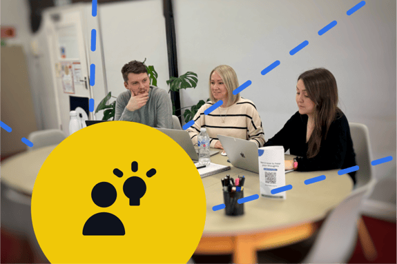
We can recruit representative participants that match your audience, ensuring the feedback is meaningful and actionable. As part of the process, we manage consent and screening, and can run sessions either remotely or in person depending on what works best for your users. This way, you get reliable insights from the right people without the admin burden of organising it yourself.
CRO for e-commerce focuses on making it easier for customers to buy. It starts by analysing real behaviour: where shoppers arrive, how they move through product pages, and where they abandon the journey. Common friction points include slow or cluttered product pages, unclear pricing, limited delivery information, poor mobile layouts, and checkout steps that feel confusing or risky.
Once the barriers are clear, improvements are made in small, targeted steps. This often includes refining product page layouts, tightening copy, simplifying filters, improving add-to-cart behaviour, and streamlining the checkout. Trust signals, clearer calls to action, and better mobile usability also play a major role.
The goal is simple: reduce hesitation, build confidence, and make the path from product view to purchase as smooth as possible. Done well, CRO increases revenue without relying on more traffic.
The impact of CRO varies depending on the size of the issues uncovered, but meaningful gains are common. Small, targeted changes can lift conversions by a few percent, while resolving major friction points can lead to increases of 20% or more. For sites with serious usability or trust issues, the improvement can be even higher.
What matters most is focusing on evidence. When changes are based on real user behaviour rather than guesswork, the results compound over time: higher conversion rates, better retention, lower acquisition costs, and more revenue from the same traffic. CRO is not a one-off tactic but an ongoing process that keeps your site performing as user expectations evolve.
CRO can start showing results quickly, but the timeline depends on traffic levels and the type of improvements being made. Fixing clear usability issues often produces an immediate uplift. If you’re running A/B tests, you need enough traffic to reach statistical confidence, which can take anywhere from a few days to a few weeks.
Most businesses see early wins within the first month, with bigger gains coming as improvements compound over several cycles of testing and refinement. CRO works best as an ongoing process: each insight leads to another opportunity to reduce friction and strengthen conversions over time.
CRO for service-based businesses focuses on building trust and reducing hesitation, because most conversions rely on enquiries, bookings, or consultations rather than instant purchases. The goal is to understand what information people need before they feel confident enough to get in touch.
It starts by analysing user behaviour: how visitors move through key pages, what they read, where they stop, and which elements cause doubt. Common friction points include unclear value propositions, weak service explanations, missing pricing guidance, forms that feel too long, or a lack of social proof.
In most cases, you shouldn’t pause SEO or PPC while doing CRO. They work best together. CRO improves what happens after someone lands on your site, while SEO and PPC drive the people who arrive there in the first place.
Pausing traffic channels can slow your momentum and make it harder to measure improvements. CRO needs real traffic to reveal friction points, validate changes, and run reliable tests. If you cut off that traffic, the insights and results will take much longer to appear.
The smarter approach is to keep SEO and PPC running, then:
- fix the biggest usability and trust issues first
- improve landing pages used in paid campaigns
- refine content and journeys so organic traffic converts better
CRO makes your PPC spend more efficient and strengthens the return on your SEO efforts.
Opinions and insights.
Explore more of our thinking in the blog, where we break down industry trends, share practical advice, and offer insight into where digital is heading.
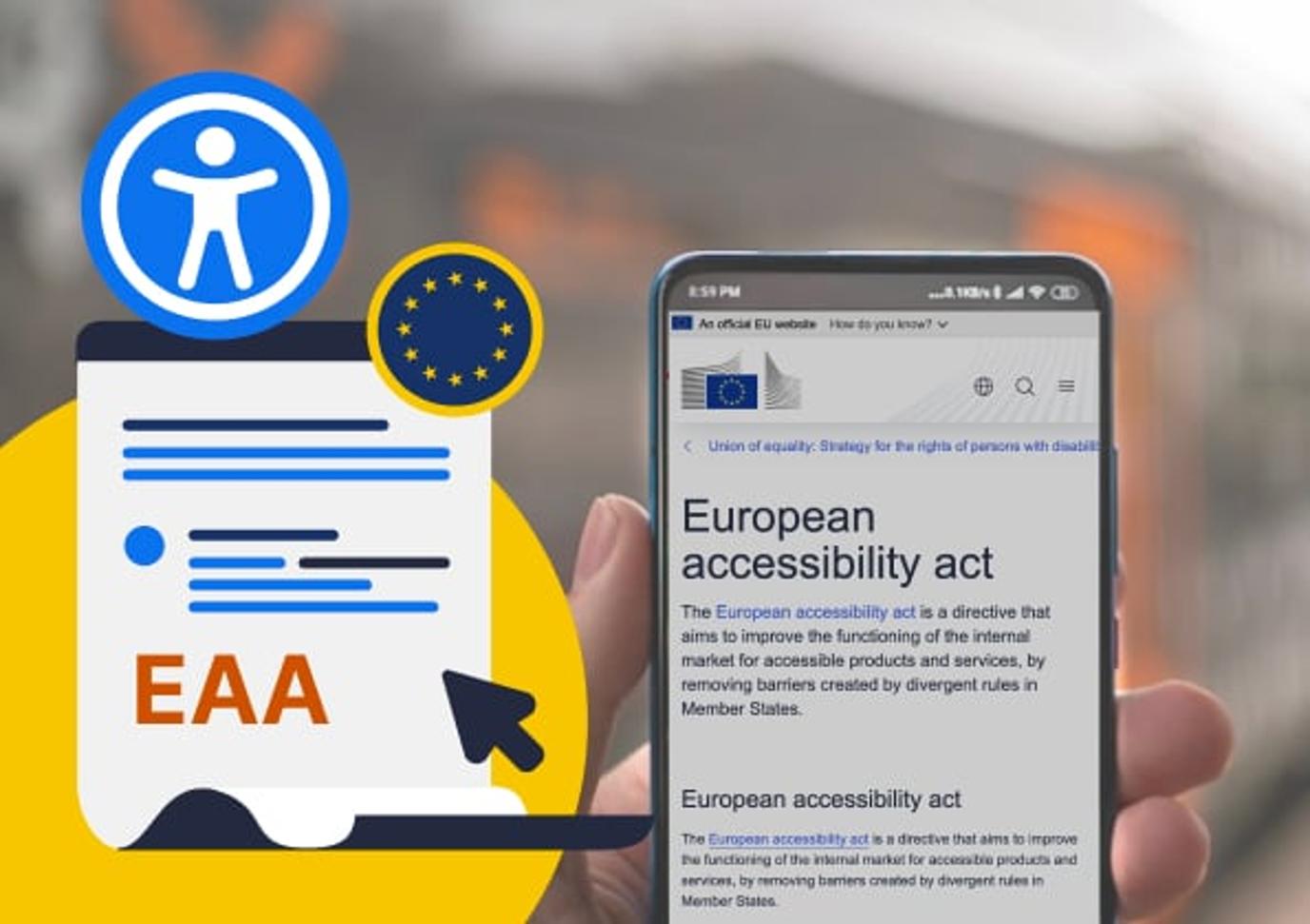
The European Accessibility Act (EAA)
Is your accessibility overlay killing your design?