Accessibility and inclusive design.
Ensuring your website is accessible isn’t just about compliance, it’s about creating an inclusive experience for all users, regardless of ability. At We Create Digital, we specialise in designing and developing accessible and inclusive websites, that meet WCAG level AA or AAA, as well as carrying out detailed accessibility reviews to help businesses and public sector organisations improve their digital presence and maximise their audience.
With a CPACC qualified member of staff and a great team of advocates for accessibility we are ready and waiting to help. Whether you’re starting fresh or looking to improve an existing site, our accessibility services can help you create an online presence that is compliant, inclusive, and future proof.

Audits and remediation
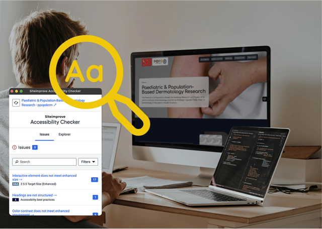
We provide automated accessibility audits and comprehensive accessibility reviews. We help large organisations resolve issues quickly and ensure full compliance.

WCAG 2.2 compliance
Our team helps organisations build, test, and maintain WCAG 2.2 compliant digital products, ensuring accessibility for users with disabilities.
Please contact us directly to learn more about WCAG 2.2 certifications.

Sector requirements
Sectors such as healthcare, eCommerce within Europe and the UK public sector have specific requirements including keyboard navigation, screen reader compatibility, 300% zoom capability, and high-contrast, readable text.
Accessibility from the start.
As a web accessibility agency, we build accessibility into every stage of the web design and development process from the start. Our approach follows WCAG (Web Content Accessibility Guidelines) criteria and best practices, ensuring that your website is usable for people with disabilities, including those who rely on screen readers, keyboard navigation, or alternative input methods. We also consider inclusive design.
We focus on:
- Clear and logical structure: making navigation intuitive and easy to follow
- Colour contrast and readability: ensuring text is legible for all users
- Keyboard accessibility: designing for users who cannot use a mouse
- Alternative text and multimedia support: making images, videos, and audio content accessible
- Form and interaction design: ensuring forms, buttons, and interactive elements work smoothly for all users

Accessibility auditing and strategy.
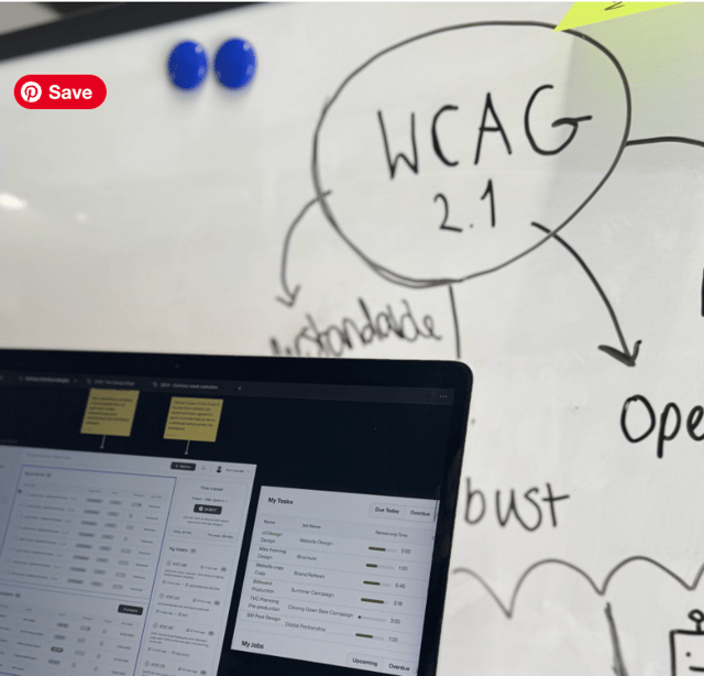
Our accessibility services make it easy for your team to manage an inclusive website, with clear guidelines and accessible design practices integrated into each project. As you continue to develop or work on your website, it is vital to ensure your digital presence remains accessible, up-to-date and aligned with the latest standards. We can help you build a strategy, so accessibility is always a priority.
If you have an existing website, we offer detailed reviews to help you understand its current accessibility status and areas for improvement. Our audits include:
- Automated testing using trusted tools
- Manual testing with keyboard-only and screen reader methods
- Detailed reports and actionable recommendations to enhance accessibility
- Ongoing support and training to help your team maintain accessibility best practices
We’ve even developed our own accessibility testing tool, as we wanted to create a low-cost option for organisations to be able to use, so accessibility can become more accessible itself.

Support with accessibility compliance.
Many organisations we speak to are looking for the best accessibility agencies for website compliance. This is because they don’t know if their site is compliant, have been told their website isn’t WCAG compliant, but don’t know where to start, or they know their website is accessible in some places but not others.
We can act as a partner to guide you, rather than just dump a 100 page PDF showing the results of an audit. We will create a strategy that is easy to implement while working with you to provide immediate fixes to priority areas. This can be a long-term relationship, to ensure that you become compliant, and remain that way.
Furthermore, if you’re concerned about a PSBAR audit, then we can run a mock audit to help spot any errors.
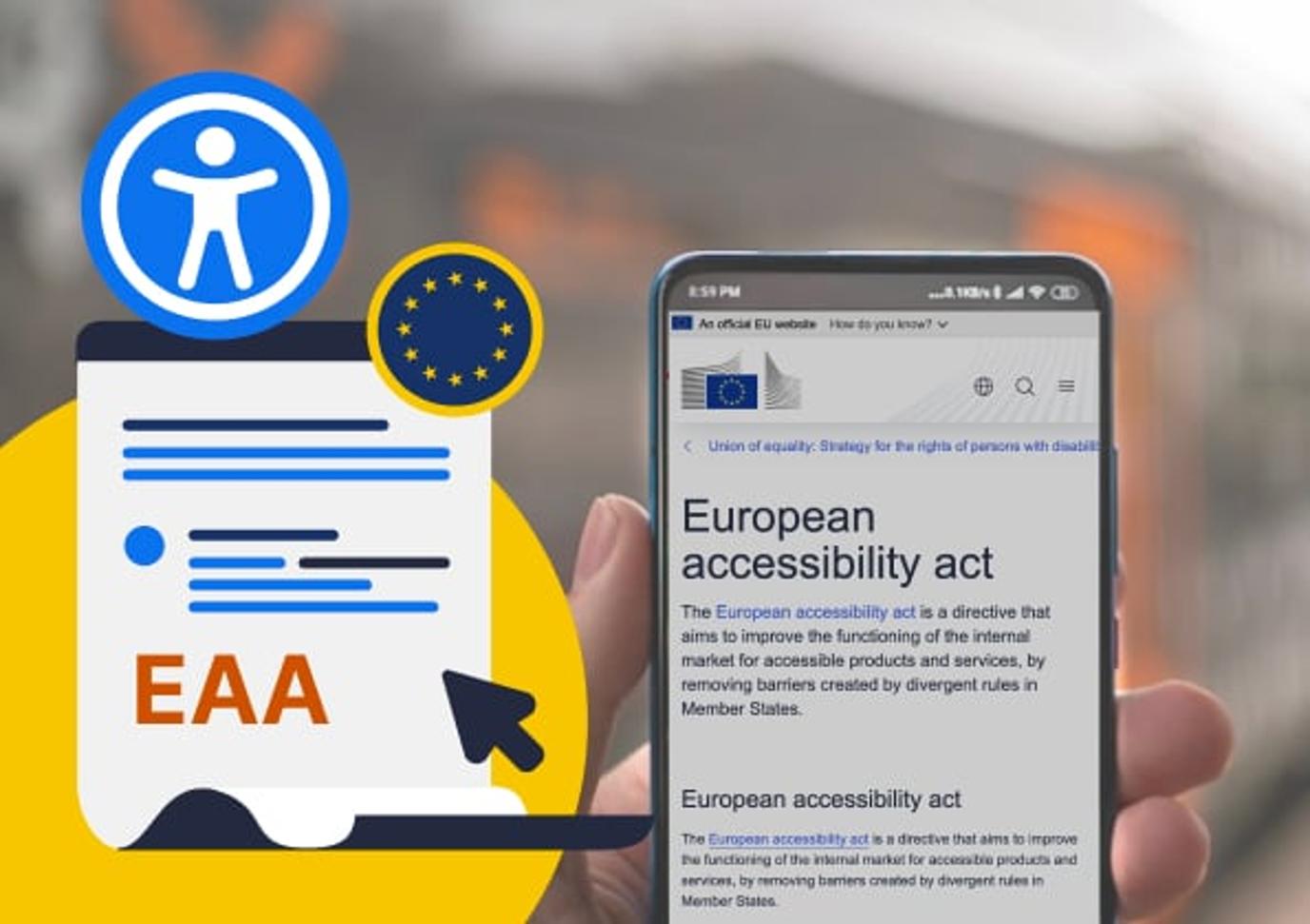
Meeting legal accessibility obligations across the UK and EU.
Complying with accessibility guidelines is also a legal requirement for public sector bodies in the UK, and we have supported many organisations in meeting these standards.
New regulations are also now in place under the European Accessibility Act (EAA). While the EAA does not apply to organisations operating solely in the UK, it will impact those working across the EU. Businesses must comply with the Act by 28 June 2025 – there are some exclusions, but these need to be carefully checked to see whether they apply to your business. Given this, it is crucial that organisations put in place plans to make their websites fully accessible.
Why accessibility matters for business growth.
Accessibility helps businesses reach a wider audience, improving user satisfaction and loyalty while increasing revenue and sales potential.
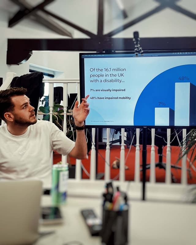
A 2019 report found that 69% (4.3 million) of disabled internet users clicked away from websites with accessibility barriers. The organisation behind the report also found that as a result of these barriers, £17.1 billion of revenue was lost to retail websites. As a digital accessibility agency, we can identify where you may be losing users and make improvements to your website to remove those blockers.
Accessibility features are particularly valuable in customer-facing industries, where compliance supports inclusivity and meets the needs of all users, an expectation that continues to grow among UK consumers.
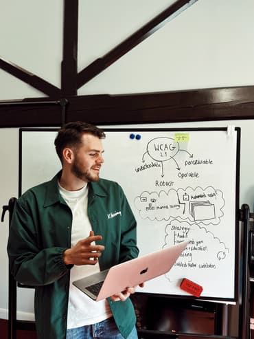
Accessibility training.
If you want to ensure your brand and website remain accessible, we provide tailored accessibility training. This empowers your team to build inclusively by default. Our sessions combine practical workshops, strategy development, and clear internal guidelines to help you embed accessibility into every stage of your process. We also offer ongoing support and scheduled reviews to help you stay compliant and maintain accessibility standards as your organisation evolves.
We believe accessibility is more than meeting regulations. By focusing on inclusivity, we help your organisation create a smoother, more welcoming experience for every user, while strengthening your brand’s reputation.
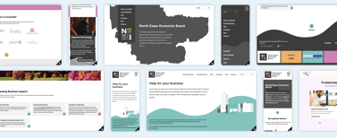
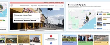
Our website accessibility portfolio.
Take a look at some of our accessible projects
Explore a selection of our recent projects, including work with public sector organisations where accessibility and compliance were essential from day one. These case studies show how we design and build for real users, meet strict standards, and support teams who need reliable, inclusive digital services.


Supporting organisations to make websites accessible
Make your website more accessible today
Whether you need a new website designed with accessibility in mind or want to improve your existing site, we’re here to help. Get in touch to find out how we can support you in creating a more inclusive digital experience that reaches more users.
Website accessibility FAQs.
We work to WCAG 2.2 AA as the baseline, but we can ensure you have a website that is the level you are looking for – whether it is A or AAA. Our team regularly refers to the Public Sector Bodies Accessibility Regulations and relevant GDS guidance, as well as keeping up to date with any developments.
Yes. We test templates, components, forms, navigation, content patterns, and any custom functionality. We also review design decisions that may cause accessibility issues before build.
We build in accessibility checks to a number of points within our projects – at kick-off, before design begins, during design, before designs are signed off, before development begins, during development, pre-launch and post-launch.
Yes, we can produce a compliant accessibility statement with an audit or new build. Depending on your content, this can include known issues, planned fixes, and review dates.
Yes. We combine automated scanning with manual checks across key user journeys, screen reader tests, keyboard-only navigation, and colour contrast reviews.
Yes, we have delivered accessible websites for organisations across education, local government, and community services. Examples of our public sector sites can be found in our portfolio.
Yes, we can train content editors, designers, and internal teams to help maintain accessibility on websites and platforms after launch. We would recommend carrying out regular reviews to ensure that a site remains accessible.
Yes; we offer ongoing monitoring, periodic audits, and support to ensure your site stays compliant as standards evolve. We can also help produce an accessibility strategy that can cover all of this.
Our Accessibility Lead has the Certified Professional in Accessibility Core Competencies (CPACC) certification. This certification is provided by the International Association of Accessibility Professionals, or IAAP.
He regularly trains other members of the team, either in team-wide sessions, through one-to-ones or by sharing information across the team. This means that accessibility is an approach that the entire team has front-of-mind.
Yes, we can support you with developing new branding. We can create branding that is clear, consistent and practical to use across digital and print, with accessibility built in from the start.
We can help with:
- Creating a visual identity including logo, colour palette and typography
- Building accessibility into your brand decisions
- Producing practical brand guidelines for day-to-day use
- Applying the new brand across your website and key assets
If you already work with a brand agency, we can partner with them. We regularly collaborate with external teams, ensuring the brand strategy aligns with the digital experience and is implemented consistently across your website. Whether you’re starting from scratch or developing an existing concept, we’ll fit into the setup that works best for you.
Not necessarily. Unfortunately a lot of the accessibility plugins and overlays we see in place don’t make a website fully compliant.
Most tools only fix issues on the surface and rely on automated scripts, which can only detect a small percentage of real accessibility problems. They sometimes give a false sense of compliance, which increases legal and reputational risk. There are cases of organisations having legal action taken against them for exactly this scenario.
Furthermore, there’s a wider issue with these add-ons. They actually damage the user experience while trying to claim they provide accessible features. For example, there is a popular one that once you turn on, if you’re doing anything on a page such as filling in a form or survey and then turn the plugin off, it refreshes the page.
In order to have an accessible website, you need to do more than add a plugin and assume it’s fixing all of the accessibility issues.
We can support with any part of your process or website, including simply providing a set of accessible designs.
However, we aren’t just an accessibility design agency, and we would recommend that while developers can follow designs, testing should still be carried out post-development and pre-launch to check for any issues.
We can provide detailed documentation and handover guidance to developers, but final testing will help to identify whether you are compliant.
Organisations we work with are often looking for an agency partner when it comes to accessibility for website redesign, and the reason for that is they know they need to do more than simply outsource it.
If we are redesigning and redeveloping a website so it is accessible, we make sure accessibility is built into every single stage, from the first meeting through to post-launch. We will also work closely with you to identify any issues that may go beyond the website too. For example, anything in your brand guidelines regarding colours and fonts, but also content on your site.
Yes, our accessibility agency services also cover mobile app compliance. We can review your app and help to address any issues with it. This can include making changes or working closely with your app developers to support them in understand what needs to change to make the app accessible.
Some of our accessibility blog posts.
Explore our latest insights and updates on digital accessibility. We share practical guidance, research and lessons learned from our work with public sector teams and organisations of all sizes.
Our posts cover topics such as the WCAG 3.0 draft, common accessibility issues we see in real projects, and whether plugins or overlays actually improve accessibility. Each article aims to give clear advice, highlight risks, and support teams that want to build more inclusive and compliant websites.
WCAG 3.0: what’s changing and why it matters
WCAG 3.0 marks the biggest shift in accessibility standards in over a decade, expanding what is covered and how accessibility is measured.
The European Accessibility Act (EAA)
The European Accessibility Act is legislation that sets out common accessibility requirements for a range of products and services in the European Union.
Why online accessibility is a smart marketing move (not just a nice-to-have)
When we talk about online accessibility, it’s often framed as a legal requirement or an ethical obligation, and rightly so. But there’s another dimension that marketers and business owners should be paying attention to: accessibility is also a growth strategy.