App development.
We create, redesign, and improve mobile applications Helping you launch faster, scale smarter, and deliver better results. Whether building from scratch or improving what you have, we deliver mobile apps that perform.
Custom mobile app development.
Every business has different challenges, so we shape our approach to fit yours. We can build new mobile apps from the ground up, breathe new life into outdated products, or refine existing apps to perform better. Our goal is always the same: to deliver reliable, user-friendly applications that support growth and long-term success, and meet the objectives of your organisation.


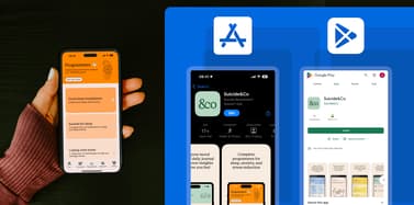
Apple and Android app development.
We design and build applications that perform seamlessly on both iOS and Android. By working with the latest native and cross-platform frameworks, we ensure your app takes advantage of each platform’s strengths while maintaining a consistent look and feel. From interface design and secure integrations through to testing and submission on the App Store and Google Play, we manage the entire process so your app is reliable, user-friendly, and ready to scale.
Our experience covers everything from customer-facing apps that drive engagement to business tools that streamline internal processes. We design with long-term sustainability in mind – making sure updates are straightforward, security is robust, and the codebase is future-proof. Whether you’re launching a brand-new product or modernising an existing one, we deliver mobile apps that perform to the highest standards on both Apple and Android.

Our approach to app development.
We believe successful apps come from combining technical expertise with a clear understanding of your business goals. That’s why every project starts with a discovery phase: we take time to learn about your organisation, your customers, and what you want to achieve. This shapes the strategy and ensures the finished product does more than look good – it delivers measurable results.
All of our work is carried out by our in-house team in Essex. We don’t outsource projects abroad or pass them to freelancers. Every developer, designer, and strategist who works on your project is part of our team, meaning we maintain complete control over quality, consistency, and accountability. For you, this means direct access to the people actually building your app and confidence that nothing is lost in translation.
Our in-house model also allows us to work faster and more collaboratively. Communication is clear, decisions are made quickly, and changes can be addressed without delay. Instead of juggling different suppliers, you get a single, dedicated team who are invested in the outcome of your project.
We also focus on long-term partnerships. Building the app is only part of the journey – we stay involved after launch to monitor performance, apply updates, and suggest improvements. Because we know your app inside out, we can provide proactive support and help it evolve as your business grows.
Tell us about your app
Whether you have an app you need help with, a clear brief to get developed, or just an early idea, we’d love to hear about it. Our team can help shape your vision, explore possibilities, and guide you towards the right solution.
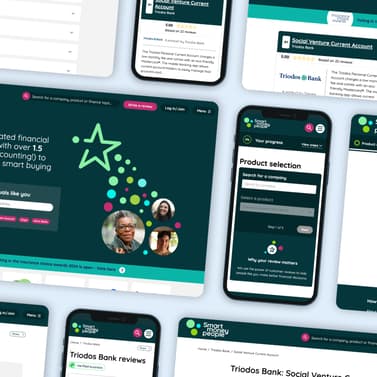
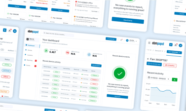
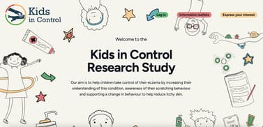
A few of the organisations we have worked with
Take a look at some of our projects.
Portfolio
Discover more about the app and web development projects we’ve delivered and how we create applications, websites or platforms that meet the needs of their users.