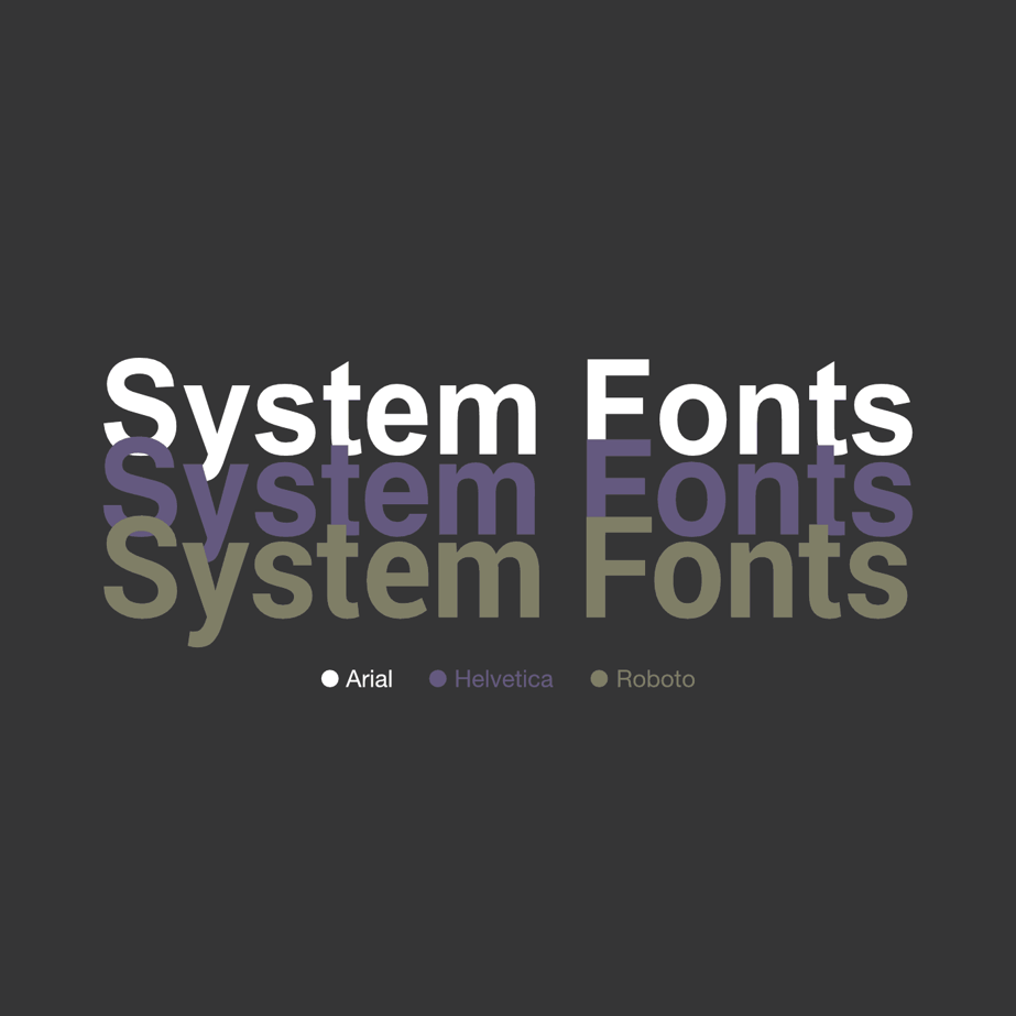
System fonts (which are built into devices) are very powerful: they load instantly, keep pages looking clean and familiar on every screen, and save visitors from downloading external web-font files.

How do you choose which font to use?
We’ve all been in the situation of trying to find the right font for our websites. Some common and simple choices are Arial, Helvetica and Times New Roman.
A lot of people like using a more extravagant looking font type. That can be done of course. However, it means you have to load a separate font file, which can have a negative impact on overall speed and performance.
But sacrificing speed and performance for an extravagant font isn’t worth it.
So what’s the solution to this problem?
System fonts.
What are system fonts?
A system font is a font which is compatible with the respective operating system. What that means is that when a website loads, the font doesn’t have to downloaded by the browser.
Who provides system fonts?
Apple created the fonts ‘San Francisco’ for desktop and ‘San Francisco Compact’ as the mobile version, announcing these at WWDC 2015.
Google also created its own System Font called ‘Roboto’, which was released in 2015.
Microsoft already had a default System Font called ‘Segoe UI’, which was released in 2004 – they have continued to work on it since it was launched.
So what are the benefits of system fonts?
Essentially, they allow you to use internal fonts within your website without having to reference an external web font file.
The point of this being that you can use a better looking, high-resolution text that doesn’t impact your website’s performance.
Focusing on user experience is more important than
Here’s one way you can do this:
Keep your website consistent across all devices.
If someone wants to quickly check your webpage on their mobile phone and they can’t read your font, they’ll probably leave your page and look elsewhere.
Using system fonts will also make your text more legible, ensuring it will be easier for users to read. This will provide a better overall experience of your website and will encourage users to stay on your website for longer.
Here's how to use System Fonts
In order to use these System Fonts you can put them within a font-stack, like so:
font-family: -apple-system, BlinkMacSystemFont, “Segoe UI”, Roboto
This line, when put into a style tag e.g. body{…}, sets the font depending on what OS is currently being used on that device.
This works because it will select a font from the front of the stack and check to see if the user’s machine has it installed.
If your computer does not have the font then it’ll move onto the next font and repeat the process, this is done until a suitable font is found.
For example, if the device is running Windows it will choose Segoe UI for the font and if it is running MacOS it will use San Francisco.
Overall, System Fonts allow you to have a modern and professional looking website but without sacrificing performance.
When every bit of code affects the speed of your website, removing just a little could be enough to make a difference.
FAQ
1. What are system fonts?
System fonts are typefaces already installed on a user’s operating system (e.g. San Francisco on macOS, Segoe UI on Windows, Roboto on Android), so browsers don’t need to download extra files when the page loads.
2. Why use system fonts on a website?
They load instantly, reduce page weight and give visitors a familiar, readable look on any device, improving first impressions and engagement.
3. Do system fonts improve page speed and performance?
Yes—because no external font files are fetched, pages render faster and score better on metrics like Largest Contentful Paint.
4. Are system fonts better for accessibility and user experience?
Built-in fonts are optimised for clarity at all sizes, so text stays crisp and legible, helping users with visual impairments and low-bandwidth connections.
5. How do I add a system font stack in CSS?
Use a font-family line such as font-family: -apple-system, BlinkMacSystemFont, "Segoe UI", Roboto, sans-serif;—the browser picks the first font it finds on the device.
6. Will system fonts look consistent across devices and browsers?
Each platform shows its native font, but the overall style (modern sans-serif) remains consistent enough that most users won’t notice a switch.
7. Do system fonts help with SEO and core web vitals?
Faster loading and fewer layout shifts boost Core Web Vitals scores, which search engines use as a ranking signal, indirectly supporting SEO.
8. Can I mix system fonts with custom web fonts?
Absolutely—many sites start with system fonts for body text and add one lightweight custom font for headings, balancing performance with brand personality.


