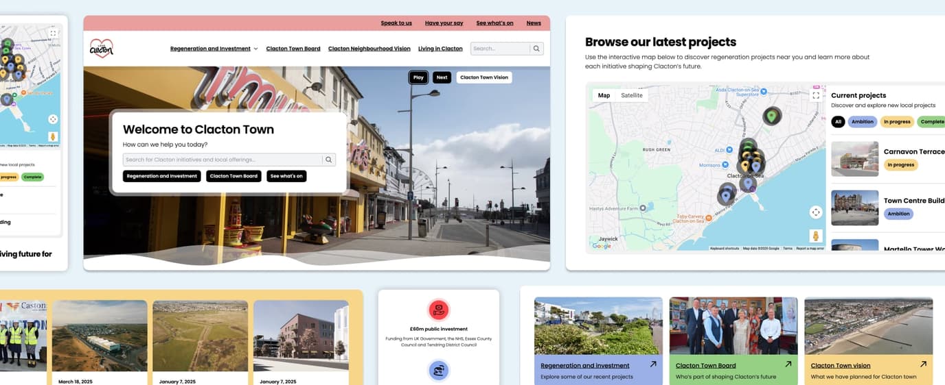
For many of our website design projects, the standard approach is one of presenting a selection of designs for a handful of different webpages such as a homepage, blog post about page and contact page. We do this as it’s what many clients come to expect or are used to.
However, there is a different approach that should be considered. For some, this may seem radically different, but it offers a more flexible and time-saving approach: modular website design. In this approach we take all the typical components and page sections that many website projects include such as headings, buttons, forms and their fields, collapsable content and article blocks. Starting from the smallest screen size, typically mobile phones, we can design and build the individual components in a way that fits and scale to any screen size.
Modular website design, rather than page design, is increasingly more appropriate in our current landscape of multiple device types and screen sizes for accessing the web.
The existing code frameworks we use contain virtually all of the components ready for implementation into a working prototype that’s responsive by default. This means that your time can be focused on reviewing not only the look, but also the feel of interacting with components; on your computer, but also importantly, tablets and phones which now account for almost half of web users.
Contact us today to discuss how we can work with you using a modular approach to design your next web project or improve an existing website.


