This post explains why click-to-open menus are more user-friendly and reliable than hover-based ones, especially on touch devices.

We get many website design clients or prospective clients asking us for hover features on their website. Often this is for their menu – it looks a bit flashy, many people seem to think it is great, but…. we don’t. Here are 11 reasons why. Most of these points apply to hover anywhere on a website, not just a menu.
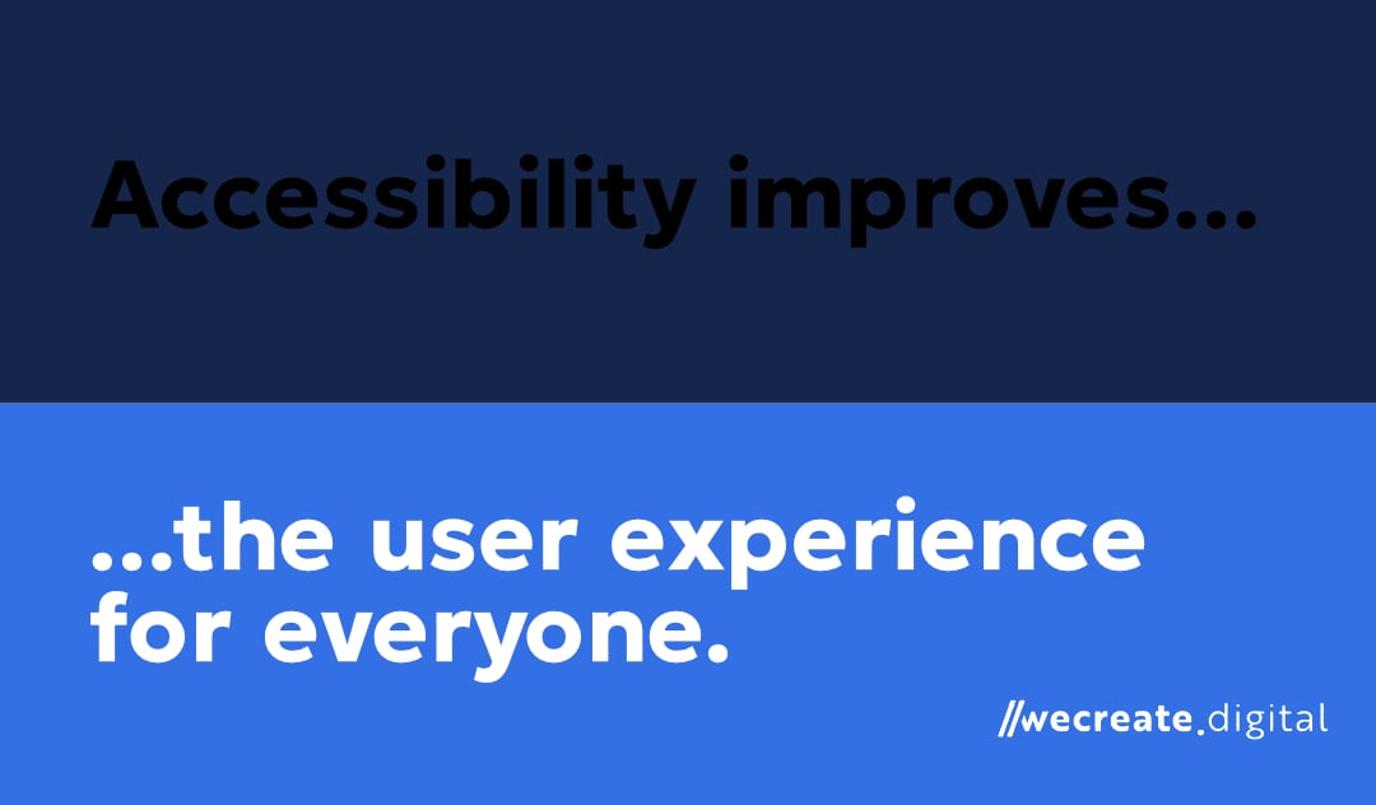
Accessibility
Accessibility is a key point around hover states. Ensuring users are able to navigate easily rather than causing frustration is the first point to consider when making the choice.
1. Mouse-hover isn’t possible for people using tablets and larger smartphones
It’s important to ensure continuity and consistent experiences across devices. Touchscreens are not just limited to phones and tablets, e.g. there’s also touchscreen laptops too!
2. Hover does not imply intent
It can be frustrating if hover menus are triggered by accident. Just because a user is moving their cursor, it doesn’t necessarily mean they are intending to interact with the navigation.
3. Some users may not be able to physically use hover
A person with mobility problems who might have issues with tremors or someone using screen-reading technology will find hover menus incredibly hard to use.
Speed
4. Due to ‘hover tunnels’, hover menus do not allow much room for error
If your cursor moves away from a hover submenu, you have ‘reset’ and initiate the process again in order to re-open the submenu. Click menus allow people to take their time to process information and allow greater flexibility in mouse movements. This leads us on to…
5. It may not necessarily be quicker to have a hover menu
People may ‘miss’ the item at the bottom of a submenu. Therefore, someone would have to reopen it and/or slow their mouse movement to avoid accidentally closing the menu.
User behaviour
6. Clicking is a more innate and natural web behaviour
For example, you click on links to go to a new page, click buttons to submit forms or click to change tabs in your browser. More impatient users may click before the hover state has had a chance to load.
7. Research has shown a majority of people prefer mouse-clicks
UX research shows that clicks are preferred by 67% of people compared to just a third of people (33%) who say hover is their preference.
Compatibility
8. There are possible incompatibilities with Internet Explorer and Microsoft Edge
These browsers regularly have problems displaying hover states.
9. There are possible double-tap issues on portable devices
Taps should not be considered universal substitutes for clicks on touchscreen devices. An initial tap can be treated as a cue by some devices to activate the hover state rather than initiate the click action. Therefore, an additional tap may be required to actually open the link. A click-based menu removes this risk.
Futureproofing
10. Making changes
We may later want to add a menu item that doesn’t have a submenu. Visitors may expect a submenu to appear when they hover on the label – worsening user experience.
11. Understanding user behaviour
If you are interested in analysing user behaviour, such as through the use of heatmaps, it would likely be much easier to track and monitor clicks than ‘hover intent. User experience is crucial to the success of a website so you need to consider how you will be able to assess what people do, what works and what doesn’t.
Hopefully, that helps to explain why hover might look good, but it can cause issues for your website. You should always consider what is easiest for users and don’t give them a reason to leave your website. Many users will view more than one website at a time. If you make the browsing experience hard for them, you may lose them.
Click vs Hover FAQ
1. Are hover-based dropdown menus bad for mobile navigation?
Yes. touchscreens on phones, tablets and even laptops have no “hover” state, so users simply can’t open a hover menu at all, making click menus the safer choice.
2. Why do click menus improve accessibility compared with hover menus?
Clicks work for keyboard users, screen-reader users and people with motor-control issues, whereas hover demands precise mouse movement that many users can’t manage.
3. What is a “hover tunnel” and how does it hurt usability?
A hover tunnel is the narrow path the cursor must follow to keep a hover dropdown open; stray even slightly and the menu snaps shut, forcing the user to start again—click menus don’t have this problem.
4. Do users actually prefer clicking to hovering for website navigation?
Yes. research cited in the post shows 67 % of people favour clicking, while only 33 % prefer hover interactions.
5. Can hover dropdowns cause browser or device compatibility issues?
They can. older browsers like internet explorer and some versions of edge mishandle hover states, and many touch devices require an awkward double-tap to activate them.
6. How do click menus make websites faster and more forgiving?
Because the menu stays open until the user decides to close it, people can move their cursor at their own pace without the fear of accidental closures or missed items.
7. Is click navigation better for tracking user behaviour and analytics?
Yes. clicks generate clear, countable events in tools like google analytics, whereas “hover intent” is hard to detect reliably, complicating conversion analysis.
8. Will click-to-open dropdowns future-proof my site navigation?
Definitely. if you later add menu items without submenus, a click pattern still feels natural, whereas hover users may expect a submenu that isn’t there, harming ux.