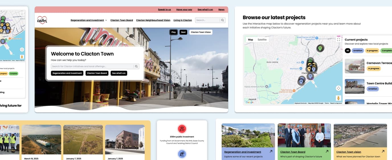
Many people see visiting a healthcare website as a small action, but for some, it’s a big emotional step. The design of that first digital interaction can make all the difference in whether someone feels ready to seek help.

For some people, even visiting a healthcare website is a big step.
That first click might come after weeks or months of hesitation. It’s private, quiet, and often filled with uncertainty. They’re not ready to book an appointment or call anyone yet – they’re just seeing what’s out there, trying to make sense of how they feel or what they’ve been going through.
There’s something known as a “door handle conversation” – when someone, only mentions what’s really worrying them just as they’re about to leave an appointment. It’s the moment they finally open up.
A website can be that first door handle.
A healthcare website might be where someone tests the water, to see if what they’re feeling is serious, if it’s normal, or if it’s something they can get help with. It could be a charity website, NHS information page or a private clinic.
Whatever it is, they’re looking for information, reassurance and direction.
That’s why design matters so much in healthcare. It’s not just about clean layouts or colour choices. It’s about removing friction. Every form, every button, every line of copy can either invite someone in or quietly push them away.
Looking for a healthcare website designer you can trust?
We design healthcare websites that are accessible, compliant, and easy
for patients to use — from private clinics and care providers to NHS-aligned
organisations.
Good healthcare design helps people take the next step.
It should feel calm, clear, and human. It should offer reassurance, not pressure. And it should be accessible and smooth – so nothing, digital or otherwise, gets in the way of someone finding help when they need it.
Because sometimes, design on a healthcare website really could be the difference between closing a door and opening one.
At We Create Digital, we think about these quiet steps a lot. Our work in healthcare isn’t just about meeting accessibility standards; it’s about empathy, clarity, and designing spaces that make it easier for people to take that first step toward getting the help they need.