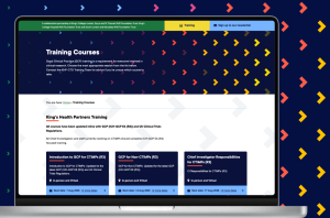
The King’s Health Partners Clinical Trials Office.
The King’s Health Partners Clinical Trials Office (KHP-CTO) supports researchers and sponsors to set up and deliver high-quality clinical trials across King’s College London and its NHS partners.
Project overview.
Client: The King’s Health Partners Clinical Trials Office
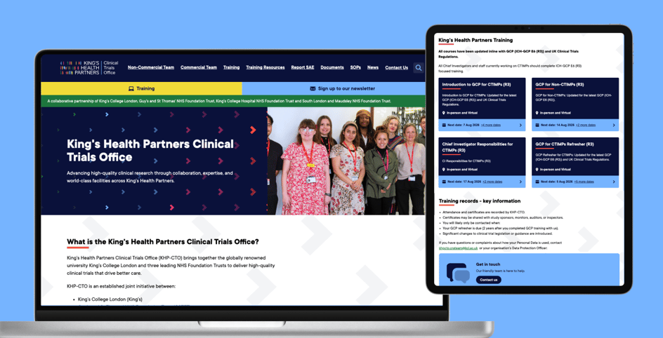
The KHP-CTO brings together expertise in governance, operations, and delivery, making it easier to run compliant, efficient studies that translate research into real-world improvements in patient care. Its website serves as the central platform for training course bookings, giving researchers and clinical staff a clear, structured way to find and book the right courses for their role. Alongside this, it acts as a secure hub for training materials and resources – making guidance easy to find, access, and manage. The site also needs to be something the internal team can maintain independently, updating content and managing bookings without relying on developer support.
The challenge
The existing website had fallen behind in almost every respect. The design was outdated and built on an ageing framework, and it hadn’t kept pace with modern standards – it wasn’t mobile-friendly, didn’t meet accessibility requirements, and no longer reflected the KHP-CTO or King’s College London branding.
The course booking experience was a particular pain point. Users were redirected to Microsoft booking forms, creating a disjointed journey that sat outside the site entirely. Training resources, meanwhile, were poorly organised and difficult to navigate, and the client had very little flexibility to update or restructure content as their needs changed. Security also needed to be addressed.
In short, the site wasn’t working well for users, and it wasn’t working for the team behind it either.
Scope of work.
- User experience
- Website design
- Website development
- Online accessibility
- Hosting
- Maintenance and support
- Infographic design
Our approach.
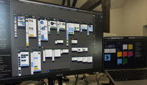
We began with a project kickoff meeting with the key stakeholders, taking time to understand their goals, challenges, and priorities before any design work started. From there, we produced full desktop and mobile designs for all pages in Figma – including every stage of the multi-step booking form – before moving into development against those signed-off designs.
A significant piece of early work was mapping out the training booking form in detail. With three distinct form types serving different user groups, the designer worked through the full user journey for each, building logic into the form so that the right information was presented to the right users at every step. This wasn’t just a UX exercise, it was also a way to work through the flows with the client, making sure the booking process genuinely matched how their users needed to navigate it.
We also developed a new set of brand guidelines for KHP-CTO: a refreshed logo, an updated colour palette, guidance on chevron usage, and font application. All were designed to bring the site into alignment with the KHP-CTO and King’s College London look and feel, while meeting accessibility standards throughout.
We referenced the KHP-CTO and KCL websites throughout the project to ensure visual consistency, though we didn’t conduct formal competitor research. The project was built on Lark, demonstrating the flexibility of the platform beyond its more typical use cases.
Before handing over to the client, we held a dedicated meeting between the designers and developers to make sure everyone was aligned on scope. The client was given CMS access to review and update content ahead of go-live, and we completed a full accessibility review and redirect implementation to preserve existing search engine rankings. Post-launch, we provided CMS training and a tailored training guide so the team felt confident managing the site day to day.
What we delivered.
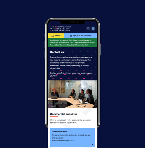
A fully accessible, mobile-friendly website built to modern standards, with a design that reflects KHP-CTO brand and gives users a clear, confident experience across all devices.
A multi-step booking form that replaces the previous Microsoft forms with a seamless, on-site journey. Users can move through the booking process without leaving the website, with form logic built in to surface the right content for different user types. A backend booking management section gives the client visibility of course registrations in one place.
Brand guidelines covering the updated logo, colour palette, chevron design, and typography – accessible and consistent, giving the KHP-CTO a cohesive identity to carry across all communications.
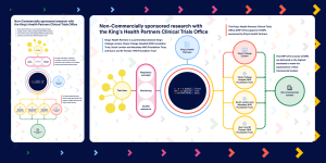
A responsive homepage infographic produced in both portrait and landscape formats, adapting to different screen sizes. Alt text was written specifically for the infographic to ensure it’s fully accessible to non-sighted users, clearly conveying the relationship between King’s Health Partners and King’s College London without relying on the image alone.
A custom newsletter template built in Campaign Monitor and thoroughly tested across email clients to ensure consistent appearance regardless of how or where it’s opened.
Full content migration, including a comprehensive redirect list to protect existing SEO rankings and maintain user journeys from the old site.
Craig Macpherson
Head of Operations | King's Health Partners Clinical Trials Office
Challenges worth noting.
Making the homepage infographic accessible was one of the more involved challenges of the project. The client had a clear vision for it, and delivering that in a way that worked responsively across screen sizes – while also meeting accessibility standards for non-sighted users – required careful thought. The solution, different image formats for different screen sizes combined with descriptive alt text, meant no user was left without the information the infographic conveyed.
A late-stage request to introduce repeated chevrons as a page background also required additional design work, managed and delivered without disrupting the overall timeline.
The results.
The new site is a significantly better experience for both the people using it and the team managing it. Users have a clearer journey to the resources and courses they need, the booking process is structured and intuitive, and the site holds up properly on mobile. Internally, the team has the flexibility to manage and update content independently — something the old site didn’t allow.
Since launch, we’ve continued to provide ongoing support, helping with ad hoc improvements, responding to refinements, and supporting the team as their needs develop.