Gibbons Engineering Group.
Gibbons Engineering Group supplies specialist equipment – fans, pumps, motors, drives, and related services – to industrial, commercial, and manufacturing clients across the UK. They combine a broad product range with deep technical expertise, helping clients find the right solution rather than simply selling off the shelf.

Project overview.
Client: Gibbons Engineering Group
Gibbons had built a strong reputation over many years. They work with some of the UK’s best-known organisations – major airports, banks, healthcare providers, pharmaceutical companies, and agricultural businesses, among others. Their technical knowledge and expertise is impressive, but their website didn’t fully reflect this.
When a user visited the site without already knowing the business, it was difficult to work out what Gibbons Engineering Group did or where to go. The structure was confusing, the design was dated, and the user experience was inconsistent to the point of being disorienting. Every section of the site seemed to follow its own logic. Product pages were laid out differently from one another. Services and products were tangled together in a way that made neither clear. There was no obvious call to action, no clear path to making an inquiry or purchasing a product, and almost none of the trust signals that would help a new customer feel confident in what they were looking at.
The performance issues compounded the problem. The site was failing Core Web Vitals, the mobile experience was poor, and across the board it simply didn’t reflect the quality and scale of the business.
Gibbons Engineering Group needed a website that could match who they actually are.
Scope of work.
- Research and discovery
- Content strategy
- User experience
- Website design
- Web development
- Accessibility
- Hosting and maintenance
Rael Bearman
Marketing Manager | Gibbons Engineering Group
Our approach.
Discovery and research
We started the project by meeting with the team to really understand the business, go through the pain points with the existing site, and talking through what success looked like for them. From there, we carried out competitive research and spent time mapping out the different ways someone might arrive on the site and what they’d be looking for.
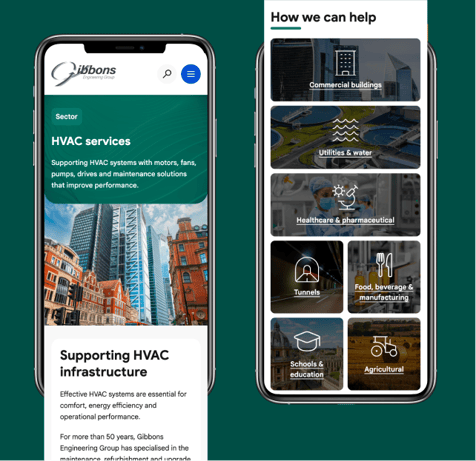
That user journey work was important. A visitor to the Gibbons Engineering Group site might know exactly what they need – a pump motor, a drive, an EV charger – and want to find it quickly. Someone else might be looking for a service: HVAC support, panel building, drive hire, electrical work. Another visitor might want to know whether Gibbons has experience in their sector – healthcare, agriculture, pharmaceuticals, tunnels, commercial buildings. Each of those visitors has a different path through the site, and the site needed to work for all of them without feeling complicated.
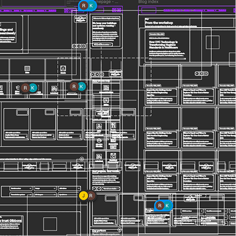
Once we understood those journeys, we could build a structure around them.
Content strategy and the product matrix
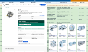
One of the most significant pieces of work we did wasn’t design or development – it was content strategy. The existing site presented products inconsistently: each category seemed to follow its own rules, which made the experience feel fragmented and unpredictable. The solution was to develop a product matrix. We took all of the existing products and mapped them into a shared structure – identifying which fields and data points were relevant across every category, and which were specific to particular product types. The challenge was that certain products had very different specifications. The solution needed to be flexible enough to accommodate that variety while still feeling consistent for the user.
What we landed on was a dynamic back-end approach: when a product is added and a category is selected, the system automatically knows which fields to present. The structure is the same, but the content adapts. From a user’s perspective, navigating from one product type to another feels coherent – same layout, same logic, same expectations – while each product still gets exactly the fields it needs.
Design
The design brief was clear from the start: clean, precise, and technically credible. Gibbons has extensive industrial expertise and top-level client relationships, and the site needed to reflect both the rigour of what they do and the quality of who they work with.
We stripped back the visual noise of the old site significantly. The previous design had multiple colour variants of the Gibbons logo in use – red and blue assigned to different categories – which created problems the moment you tried to scale it. With enough sectors and services, the colour system had broken down. We removed that approach entirely and brought everything back to a cleaner, more professional palette that works at any scale.
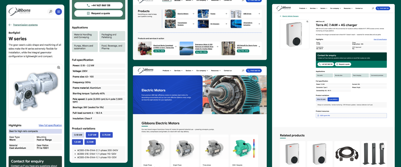
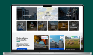
In its place we used strong lifestyle and product imagery, clear typographic hierarchy, and a visual language that feels authoritative but without being cold. The use of case study imagery and testimonials throughout – including on the hero of the homepage – makes an immediate impression. We also introduced an infographic element to help communicate some of the more complex technical or structural information in a way that’s visually engaging and easy to digest.
Structure and consistency
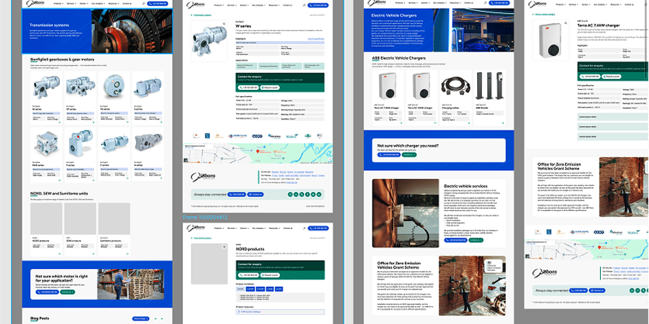
Consistency was a central design principle, not just an aesthetic one. On the old site, users couldn’t tell whether they were on a product page, a category page, or something else entirely – because the layout kept shifting. On the new site, that ambiguity is gone.
Index pages look like index pages. Category pages are clearly structured with a heading, a description, and a consistent card layout that surfaces the key information for each product. The card design adapts to the category – the fields shown for a fan are different from those shown for a gearbox – but the visual language is consistent throughout.
At the bottom of every product category, related services are clearly signposted. And the reverse is true too: service pages link back to relevant products. The relationship between what Gibbons sells and what they do is now clear for every user.
Trust signals
One of the most important things the new site does is make Gibbons Engineering Group’s credentials impossible to miss. Case studies are featured prominently, including on the homepage and client logos are used where possible. Furthermore, accreditations are visible and well-positioned, and testimonials are given proper space rather than being buried.
For clients that can’t be named publicly – major organisations whose relationship they handle discreetly – we developed a way to still convey the scale and calibre of that work. Referencing a “large UK airport” or a “major British bank” lets a prospective client understand the tier of organisation that Gibbons Engineering Group works with, without compromising confidentiality.
Accessibility, performance, and mobile
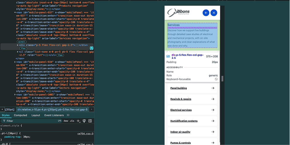
Accessibility was built in throughout. The site needed to work properly across devices, be straightforward for as many people as possible to use, and perform well on Core Web Vitals – all of which the previous site had failed on. These weren’t nice-to-haves; they were fundamental requirements of a site that genuinely serves its users.
The results.
The finished site is a significant step forward – not just visually, but structurally. It’s clean and precise in a way that reflects what Gibbons Engineering Group actually does. Visitors now understand within seconds what the business offers, which sectors it serves, and why they should trust it.
The consistency that was missing from the old site is now central to the experience. Users know where they are and what to expect at every step. The relationship between products and services is clear. The CTAs – whether that’s a product enquiry form, a purchase link, or a sector-specific page – are obvious and accessible.
The trust signals that were absent before are now front and centre. Case studies, testimonials, and accreditations are no longer buried – they’re part of how the site makes its case from the first moment a visitor arrives. The website now reflects a business whose reputation has been built over decades of excellent work.