Aesthetics mean little if people can’t read your content. Getting colour contrast right is a small step that makes a big difference to accessibility.
At We Create Digital, we see one simple design issue cause big accessibility problems: colour contrast.
It’s a £0 design decision that can make your website either easy to use or impossible to read. And it doesn’t just affect people with low vision or colour blindness. Poor contrast also impacts anyone trying to read your site outdoors, as they’re walking towards the station, on a bright laptop screen, or late at night with tired eyes.
Accessibility isn’t about ticking boxes. It’s about whether your content is usable or unusable.
The problem
Many colour issues start with well-intentioned but inaccessible design choices:
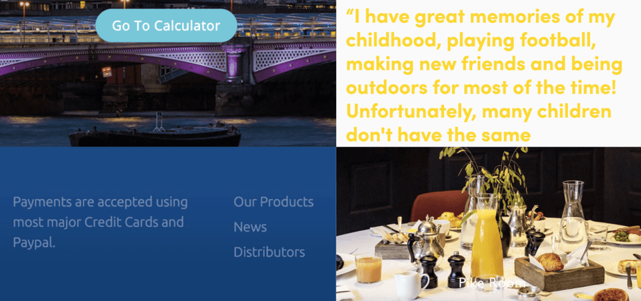
- White or light text over pale backgrounds or busy images
- Shades of the same colour layered together
- Brand palettes created without checking contrast
The result is content that looks fine to a designer but becomes unreadable in the real world.
According to the Web Content Accessibility Guidelines (WCAG):
- Normal text needs a contrast ratio of at least 4.5:1
- Large text (bold or 18pt+) should meet 3:1
When these levels aren’t met, users leave quietly. Low contrast means:
- Higher bounce rates
- Shorter visits
- Missed opportunities to communicate your message
The solution
Contrast is one of the easiest accessibility fixes to make. It’s measurable, visual, and often costs nothing. Make it part of your design and maintenance process:
- Test early: run every colour combination through a contrast checker before launch
- Fix live: if your site’s already up, darken foregrounds or lighten backgrounds until you meet 4.5:1 (or 3:1 for large text). Use overlays or boxes behind text where needed
- Audit regularly: a brand refresh, a new image, or even a “small tweak” can undo good contrast. Schedule accessibility checks like you would security or performance reviews.
The result
When contrast is right, your site simply works better for everyone. You’ll see benefits including:
- Improved readability for all users, from people with visual impairments to those on mobile in bright light
- Better engagement because your message is actually visible
- Reduced legal risk if you work in a sector with accessibility requirements
Good contrast is inclusive by design. It shows that you care about real people, not just aesthetics. And in most cases, fixing it costs nothing.
In summary
At We Create Digital, we believe accessibility isn’t optional. It’s fundamental to good design. Contrast is one of the simplest ways to make your site more usable, inclusive, and effective.
If you’d like support reviewing or improving your website’s accessibility, we can help you identify quick wins and long-term improvements – without losing your brand’s visual identity.
Get in touch to start your accessibility review.