Read the latest insights and trends.
Knowledge is power, and we prioritise continuous research and development across our
services to deliver
maximum value to our clients. This means staying informed, adapting to industry changes, and providing
regular updates on news and insights.
08 May 2025
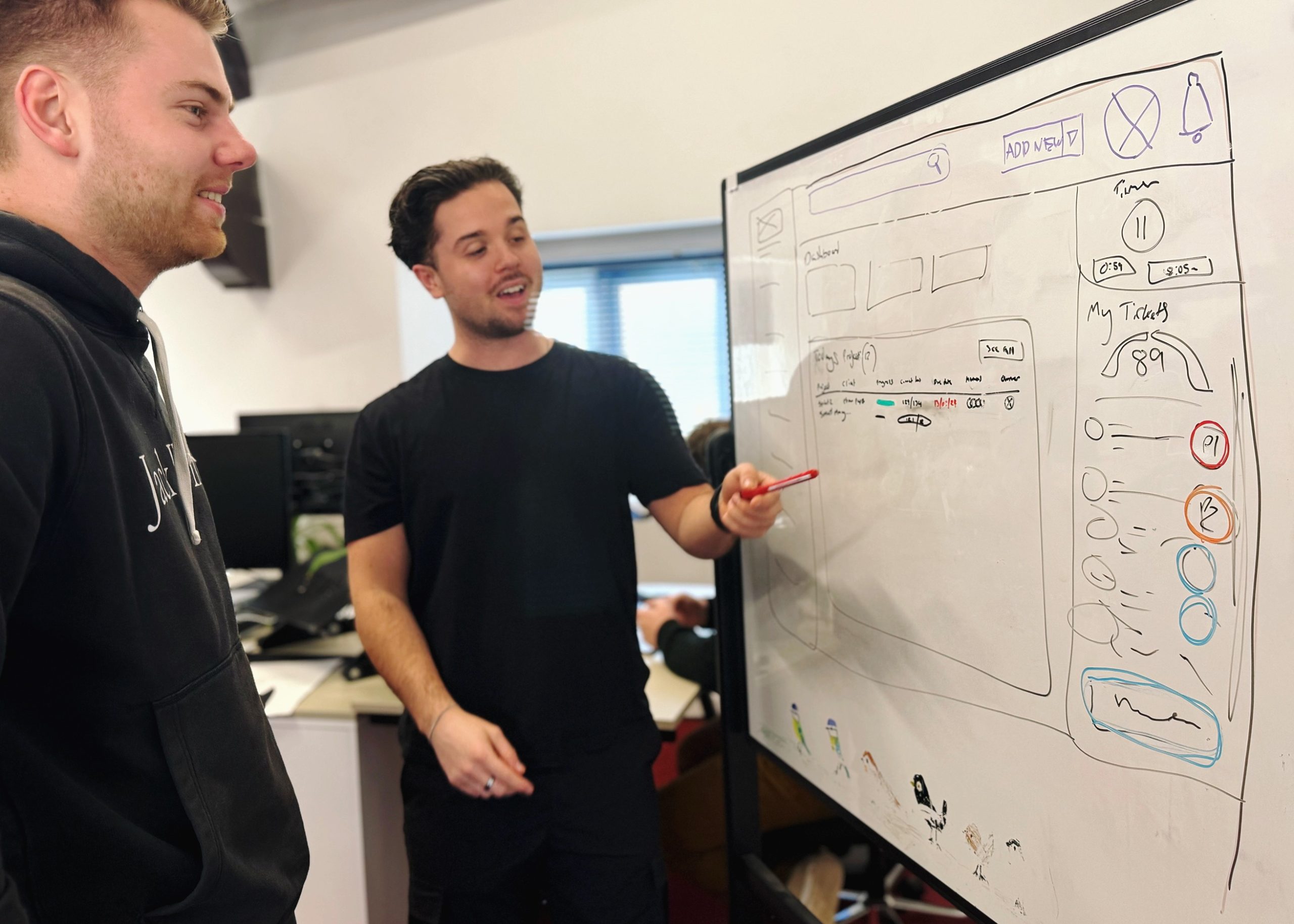
How do you know if an idea is a good idea?
We’ve been building a platform to solve the admin chaos agencies face – last week, we saw it strike a real chord.
Web development

06 May 2025
Why it’s time to rethink the environmental impact of digital
As the digital world expands, so does its environmental impact, and it’s time we paid closer attention to the hidden cost of our websites.

01 May 2025
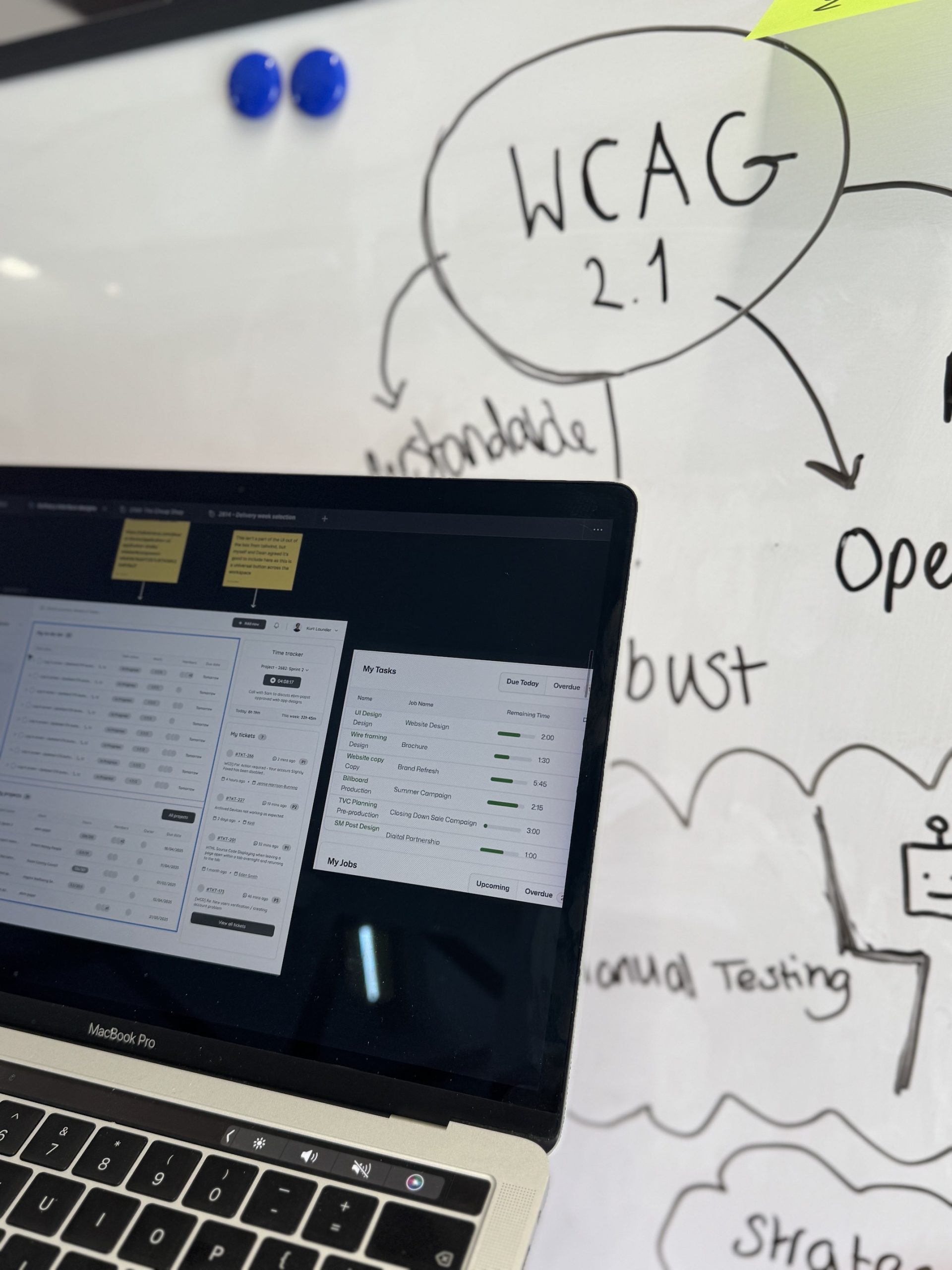
Accessibility website audits: what they are and why they’re worth it
When it comes to digital inclusivity, accessibility isn’t just a ‘nice-to-have’, it’s a necessity.

30 April 2025
Core Web Vitals explained – and why they matter for SEO
Core Web Vitals are Google’s key metrics for measuring user experience, and they play a crucial role in how your website ranks in search results.

29 April 2025
How to use AI agents in your business
One of the most accessible and practical AI trends for businesses is the rise of AI agents.

24 April 2025
Why choose Magento for your eCommerce business?
Looking for an eCommerce platform that can grow with your business? Magento might be the perfect fit.
22 April 2025
How accessibility improvements can reduce your website’s carbon emissions
By prioritising accessibility, you’re not just reaching more users, you’re reducing your impact on the planet.

17 April 2025
Planning your next web project: when to redesign vs rebuild
A well-planned web project starts by deciding whether to redesign for visual updates or rebuild for long-term scalability and performance.

16 April 2025
Stripe vs PayPal on sustainability
A comparison of Stripe and PayPal’s approaches to sustainability, focusing on their climate strategies, transparency, and opportunities for user participation.
Sustainability

15 April 2025
AI-generated content is now officially on Google’s radar
Google is now telling its quality raters to flag AI-generated content as “Lowest quality” if it shows little effort, originality or value

12 April 2025
The AI action figure trend isn’t the problem. The digital carbon footprint is.
The AI action figures might be fun, but they’re also a reminder: everything we do online has an impact.

10 April 2025
Where to start with AI for your business
AI is everywhere right now. Before diving in, step back to understand how it can genuinely solve problems.
There's so much more for you to see